Wednesday, December 12, 2007

"I hope we never lose sight of some of the things of the past..."


Those close to me who are still keeping up with my blog are aware that I've been under quite a bit of pressure lately. Between working two jobs at around 70 hours a week and planning for a three week trip to California this holiday season, I'm also responsible for creating a three tier wedding cake for my best friend's wedding this Friday (yes, that would be two days from now). That said, I am thrilled to be able to give you all something worth your reading pleasure, that didn't require much effort on my part.

The ever-talented and endless source of information, Wade Sampson, over at MousePlanet contacted me not long ago regarding a new article he wrote about the now-closed Disney Gallery at Disneyland. As you know, I was truly crushed by the news of the Gallery's closing, evidenced by my post last August. As Walt Disney himself said, "I love the nostalgic myself. I hope we never lose sight of some of the things of the past." In the spirit of that sentiment Mr. Sampson has captured warmly and informatively fond memories of the gallery as he knew it. Regarding his article Mr. Sampson had the following to say:

"Lainey, you were the inspiration for this column.
Your first posting eloquently captured how the Disney Gallery effected
your life and later career choices just as the Disneyland Art Corner
effected my generation. I still have my blue Disneyland Art Corner
artist membership card that I proudly flashed to my elementary school
contemporaries to prove that I was going to be a Disney animator. The
card came with the Animation Kit sold at the Disneyland Art Corner.
Today, it is battered, dog-eared and my crudely scrawled ink signature
has faded somewhat and it is now kept in my "treasure box" of memories.
When the Disney Gallery opened many years later, it inspired me to study
Disneyland with the same passion I studied animation and your posting
brought back that rush of memories so I decided to say one final
farewell to the Disney Gallery I knew. Hope you enjoy the column."


I hope all of my readers will read Mr. Sampson's article, as it is just as entertaining as it is informative. The article on MousePlanet can be reached by clicking here. I want to send my warmest wishes and kindest thanks to Mr. Sampson for the flattering tribute and the nostalgic look back at a special place that means a lot to me and many of my readers.

Thursday, November 29, 2007

Stamp of Approval


It's that time of year again folks... Retail stores are bustling, snow is foreboding, and that general holiday sparkle lights up the faces of little boys and girls around the world. Okay I realize it's still November. But with Christmas only 25 days away, it's time to start thinking about that always ever joyful obligation to send out annual holiday greetings.


It's not unknown that I am a lover of all things vintage. Any opportunity to hearken back to the days of yore is approached with the utmost enthusiasm. And Christmas is obviously no exception. That means getting out the old Bing Crosby LP's (or MP3's... whatever.), baking up batches of Grandma's old homestead ginger molasses cookies (recipe as old as 1890!), and of course, hand making beautiful holiday greeting cards. I can't tell you how much I delight in doing this. It's therapeutic in a way - watching Christmas movies (in particular Babes in Toyland) and sitting in front of the coffee table laboring over hand calligraphed envelopes. Ahh... The good life. No detail should be overlooked. This year, it means taking the extra special step of adding a touch of the vintage to even the postage. Thanks to a little suggestion from my lady Martha, purchasing vintage postage stamps can be done at the click of a mouse from the American Philatelic Society webpage.


I'm not sure exactly what I was expecting, but what I found was a marvelous world where fabulous designs are encapsulated in the tiny vignettes of a mere inch by inch and a half piece of paper. It's truly fascinating how good design lends itself to such practical applications as a postage stamp. Without question, some of the earlier designs from the 1950's and 1960's are chock full of brilliant flat colored designs which put many of today's holiday stamps available at any local post office to utter shame. At any rate, I haven't exactly decided which combination of stamps I will be using for my holiday cards (yes combination as mid-century letters only cost around 8 or 10 cents to mail). But they were so lovely that I just had to share them with you here. Perhaps I should let you, my readers vote on your favorites. Personally I like the mailbox motif and hobby horse stamps best. Enjoy some unusual holiday eye candy!

Thursday, November 15, 2007

Complaints Duly Noted.

A few weeks ago Miscellainey got its first real complaint. A milestone in Miscellainey's blogging history. (And no, I wasn't so shattered that I decided to abandon this blog permanently contrary to popular belief.) I'm always a bit taken aback by negative criticism, in every aspect of my life. It's not generally because I'm so sensitive that any offending response gets taken personally, but more so because I genuinely try to be as objective and careful in my writing as possible and nothing I say (especially in this blog) is meant to arouse controversy.

That said, I feel obliged to finally make a response to the comments "Mr. (shall we call him... Smith?)" made a couple of weeks ago. In response to my earlier blog entry "A Half-Baked Idea", which discusses the Symposium on Popular Song's clip "The Boogie Woogie Bakery Man", "Mr. Smith" had the following to say,

Are you really so offended by the depiction of an Asian baker making fortune cookies? Do you really think the talented people who created this cartoon were 'ignorant' and less enlightened than people today? ...You are obviously a sophisticated and intelligent writer--there's no need to hop on the anti-intellectual political correctness bandwagon by cowtowing to hypersensitive folks who seek to needlessly demonize good works and the people who created them.

Now in truth, having re-read what I wrote, I can see how my comments may have been a bit overly cautious and maybe even a bit harsh. But goodness knows I would be the first person to stand up and say that these cartoons should be considered "good works" and that the people who created them were not only smart but incredibly talented. I definitely did not mean to imply as a blanket statement that the animators of days past were less-enlightened than people of today. In fact, and I believe I've said before, today's animators would do well to take extensive notes and pay close attention to their elders of animation-days-past. Frankly a lot of what goes on TV and in the movies animation wise these days is just plain crap. And I'd rather see "Boogie Woogie Bakery Man" 100 times in a row than watch a single episode of "A Pup Named Scooby Doo". (Surely that comment alone will offend someone else...)

That said, even Leonard Maltin and Richard Sherman issued a disclaimer in their commentary about the film for its depictions and how it would be viewed in today's context. Now, maybe I'm an optimist, but I like to think we've come a long way in our treatment of all races and ethnicities over the last 50 years. And hopefully in the next 50 years the next generation can say they've come a long way from where we are now. Personally, I'm not offended by that thought. And I think it's unfair to characterize my sentiment that blanket stereotypes of days past might need to be prefaced with disclaimers as "cowtowing".

At any rate, I appreciate "Mr. Smith's" willingness to bring forth criticism, as a good dash of objectivity is healthy for all of us, and I also appreciate his recognition that I am, or at least aspire to be, an "intelligent writer". That said, my last intention with this blog is to ever offend anyone. And if I have, I do want to be notified. I may not always agree, but so is life. You can't please all of the people, all of the time.


Wednesday, November 14, 2007

Apologies...

Friends, I know it's been over two weeks since I've posted and I just wanted to extend my apologies that it's taken me so long to get back here and get some new material up. My life has been overwhelmingly busy and I've had very little free time to devote to a thorough blog entry as I would like. This is the longest I've ever gone without posting but I assure you that I'll get new material up very soon. I'm not going anywhere. Don't worry.

Tuesday, October 30, 2007

It's the Great Halloween!


No Halloween would be complete without watching "It's the Great Pumpkin, Charlie Brown!" Watching the film is even better when you have a pumpkin to carve at the same time. I love the Peanuts gang, even though Disney does get it's generous share of airtime on this blog. There's something really nostalgic about watching Schultz's creations around the Holidays. The Peanuts family has been around for over 40 years, always making appearances on prime time TV during the holidays on ABC and other family channels. You no longer need to hope and wait that the Peanuts gang shows up on TV now thanks to the recently released Peanuts "Holiday Collection" DVD which features all three major Peanuts films: "It's the Great Pumpkin Charlie Brown!", "A Charlie Brown Thanksgiving", and, of course, the classic "A Charlie Brown Christmas."


I've posted some stills from the movie just to get you into the Halloween spirit. As I was grabbing some of these images, I couldn't help but marvel at some of the great color styling. Now, the Peanuts cartoons aren't exactly high tech or chock full of special effects or even, at the most basic level, believable. But that's where the charm is. The story lines are sweet, the characters are lovable, the lessons are endearing. The movements and motions of the characters are not meant to be realistic, by stylized in the familiar Schultz form. That doesn't make the films any less enjoyable. In fact, as I was saying before, the color choices are what are really phenomenal. I particularly love the scene above that takes place at the Halloween party. The use of pink is entirely novel and it compliments, almost too perfectly, the orange and the black.

So often we get locked into the concept that palettes are limited to only one or two colors. Often ir's the one or two unexpected yet complimentary colors that make the main color scheme really pop. Schultz's film provides a lovely example of good color styling, and as ever fits perfectly with the childlike and endearing theme of the Peanuts cartoons. Afterall, Halloween's spooky frights should always be sprinkled with some childish delights!

Monday, October 29, 2007

A Very Mary Weekend


For those of you readers who haven't yet heard (I almost don't know how you couldn't have at this point, especially if you frequent this blog), San Francisco's Cartoon Art Museum opened its "Art and Flair of Mary Blair" Exhibit Saturday! Gallery Manager Andrew Farago was kind enough to send an e-mail my way announcing the exhibit and if you haven't figured it out by now I'm absolutely thrilled to see it as soon as get back to California this holiday season (what a great Christmas present!). Mr. Farago has an enjoyable live journal up, with a recent post dedicated to the Mary Blair exhibit and some tantalizing images (above image courtesy of Mr. Farago's live journal). According to the journal entry, the exhibit will showcase over 50 pieces of Ms. Blair's original work, many of which have never been available to the public before. I'm encouraging readers who have seen the exhibit to give a lively review here. I will most certainly be doing the same once I see the exhibit in December. While much of Blair's work can be seen in the well-known John Canemaker book, "The Art and Flair of Mary Blair", nothing compares to seeing an artist's works up close and in person. I really do hope readers will make a special trip to see the exhibit and show Mr. Farago and his team over at the Cartoon Art Museum some appreciation for this long overdue tribute to my favorite queen of concept.

A Half-baked Addendum

I'm thrilled to post this addendum to my original "Half-baked" post below. Reader Scott Teresi was kind enough to upload the "Boogie Woogie Bakery Man" segment from the Symposium on Popular Songs to YouTube for us to enjoy! If you haven't already dug up your copy of the Disney Treasures Rarities and other Shorts DVD to see it, you can view the segment below. Thanks again to Scott Teresi!

Wednesday, October 24, 2007

A Half-baked Idea


As a little girl growing up in Southern (okay, central) California, I went to Disneyland. A lot. What little knowledge I had about Disney World stemmed from but one sacred treasure: My "Disneyland/WDW Official Album" on cassette tape. I can't tell you how I wore this tape out. The concept that I could be transported to that most magical of places just with the push of a FischerPrice radio play button enthralled me as a child. But as I was saying, what little knowledge I had of Disney World came from my own imaginative machinations when I heard songs that were from Orlando's magic kingdom. One such song that I loved was the "Boogie Woogie Bakery Boy" segment from the Kitchen Kabaret (part of The Land at Epcot, as I later discovered). The concept was brilliant and entirely clever: a reincarnation of the Andrews Sisters Boogie Woogie Bugel Boy but with a new and goofy meaning. The first part of the lyrics are below to give you an idea of the cleverness:

We'd like to sing about a friend who has really gone far
He started with some dough and then he rose to be a star
He's hot when he uses the bread and cereal group
An oven-right trooper he can never be duped
It's known that he's no clown
The boogie woogie bakery boy the bread with the sound -
He's cute, he toots,
Toodle-oodle Toodle-oodle, Noodle-Noodle
(Mac-a-roni)
He's fast, He's fast
Pasta pasta, pasta pasta
(Say spaghetti)
He bakes with so much fun
With a hey bagel bagel and a hot crossed bun.


Readers curious to see what this segment was like can now be transported back in time and experience the Kitchen Kabaret though the craze that is YouTube (In order to get to the Cereal Sisters singing the Boogie Woogie Bakery Boy segment fast forward to 4:40). Sadly for me, I never was able to make the journey to Disney World to see it myself before the show was was yanked like so many other Yesterland memories. But the song stuck with me.

Fast forward - September 2007. There I was soaking in every detail of my Disney Rarities and Celebrated Shorts Disney Treasures DVD when I came upon the Symposium on Popular Songs (1962) hosted by Ludwig Von Drake. Suddenly before me came a familiar and entirely NOT politically correct segment meant to awaken the sounds of the wartime era with yet again, the Andrews Sisters. The segment, like the other songs in the cartoon short, was done in stop-motion animation - a form of animation where otherwise innatimate physical objects and shapes (mostly paper cut outs in this instance) are moved slightly and captured frame by frame.


The Andrews Sisters reference was obvious (see the screen capture above), and there they were again singing in that Boogie Woogie, Beat Me Daddy Eight-to-the-bar style about the "Oriental Bakery Man". The gist of the lyrics (and please I beg you, as hard as it is, try not to be shocked and offended by them and/or the animation which are entirely insulting to persons of Asian descent, bearing in mind that this did come out in the 1960's when people were still ignorant to the concept of political correctness, or were maybe just plain ignorant) are below:

He's my boogie woogie, chattanooga, sentimental, oriental, fortune cookie bakery man
And he bakes a sentimental oriental fortune cookie
in a boogie woogie bakery pan
Look Look Look Looky Looky Looky
Nice fresh hot oriental cookie
No one bakes then better than the sentimental, oriental, fortune cookie bakery man.


Wait - you ask, so that segment is an Andrews Sisters imitation of a boogie woogie sung about a guy who bakes things? Hmmm... where have I heard something like that before?... Well it seems there's not too much of a "which came first, the chicken, or the egg?" quandry here. In my opinion it seems entirely likely that the concept for the Epcot show was totally swiped from the Symposium on Popular Songs, however with the offensive language about "orientals" dumped and replaced with the more generic (and clearly less derogatory) bakery man.


I really wish I was technologically savvy enough (probably my 11 year old brother could do this) to rip that segment from a Symposium on Popular Songs onto my computer so it could be uploaded to YouTube for your viewing pleasure. I might find a way one day, but for now it appears you'll all have to be content to put on (or go buy it if you haven't already because it's a MUST HAVE) your Disney Shorts DVD number 2 and watch the Symposium on Popular Songs segment in order to compare it to the attached YouTube clip from Kitchen Cabaret. Interestingly many people have poo-pooed the Kitchen Cabaret show (I'm sure it was no Captain Eo), saying it was a cheesy attraction that needed to go. This almost always seems to be my reaction to Disney rides/movies that have been completely ripped off from another film or idea that has previously proven successful. In the end it usually ends up being half-baked. (heh. pun intended.)

Tuesday, October 16, 2007

Mary Blair is Everywhere!


I know folks, it seems like you just can't escape the wonderful world of Mary when you come to this blog, but Mary Blair fever has spread (to my utter delight) across the net and the latest blogger to give homage to my favorite leading lady of illustration is Rob Richards over at Animation Backgrounds. I have been thrilled to no end over these last few days with Rob's focus on my favorite animated feature (and no less because Ms. Blair had such a huge hand in the concept), Alice in Wonderland, in his background series (above picture must be credited to Rob, and I hope he will allow this as my post here serves to bring him due praise for his work and to encourage readers to make their way to his blog).

For those of you who haven't discovered the treasure trove of visual delights on Rob's blog, I urge, no, beg, you to stop by and take a good look at the hours of tedious laboring he's done to digitally recreate some of the most spectacular animation backgrounds (many of which are never fully visible by simply watching the flims alone). Fortunately for me, the latest focus on Alice has lead to some great discussion of Mary Blair's influence over the color styling for the movie and the likeness to her original concepts. In Monday's post, Richards observantly points out Mary's penchant for using two hues or tones of the same color in her own dress attire! (A lady who brings her sense of color and fantastic design to her own fashion - now there's a woman to love!) So please stop by Rob's blog (and send him well-wishes as he's in the recovery stages of minor surgery) and indulge in the Alice backgrounds that were strongly influenced by Ms. Blair's palette.

Jantzen - Something to Remember


Why don't they make them like this anymore? Remember when bathing suits were fashionable? Typically my blog posts don't wander into the realm of clothing and fashion, but in that these ads have some fantastic illustrations and great colors, I'm posting about them today. Further, great design need not be limited to the fantastic and intangible realms of fantasy and animation. Great design should extend to all areas of life, including, as it were, the every day swimsuit.

A bit of a tangential remark here, I spent months searching desperately for an attractive, fashionable, vintage-esque one-piece bathing suit before the summer this year, with very little success. Evidently, skin is in, as it seems is the constant trend. In my opinion, the "less revealing" one piece Jantzen suits of the 1940's and 1950's are far more flattering and sexy than the barely there string bikinis that have deluged today's beach scene. But it may have a lot to do with the way these ads portray the product - the catchy colors and slogans (and maybe also the 18 inch waists of these bomshell models) - that makes them so appealing. Vintage ads have so much charm and the potential to lend valuable insight to graphic designers of today.


The above ad is credited to illustrator Pete Hawley. More information about this artist and his work abounds at Today's Inspiration blog. The pictures posted come from two fantastic sites that I'm just having a love affair with lately: AdClassix.com, a great website that sells original vintage magazine ads and Plan59.com, a company originating just a few miles away in Fairfax, Virginia, that also features mid-century ads and illustrations. Ads are copyright of the Jantzen clothing company.


Monday, October 8, 2007

Tricks and Treats from Mary Blair

The crisp Autumn air, leaves crunching underfoot, all things culinary revolving around that heretofore underappreciated vegetable: the pumpkin, cozy wool sweaters, hot apple cider... who knew October could bring more thrills? Evidently it does...

I had put some of these Mary Blair concepts in a post draft with the intention of utilizing them to some degree in the spirit of October and Halloween and then was ecstatic to find Didier Ghez's (Disney History Blog for those of you who are unfamiliar) post announcing the Mary Blair Exhibit planned for October 27, 2007 - March 18, 2008 (Coincidence the last day is my birthday? I think not...) So now I have a great reason to merge these two great ideas into one post for today.

"The Art and Flair of Mary Blair" exhibition will be a retrospective of my favorite artist and yours, Mary Blair, held at The Cartoon Art Museum in San Francisco. According to the Disney History Blog post,

This once-in-a-lifetime exhibition includes an array of Blair's groundbreaking concept art for classic Disney feature films... and theme parks and attractions... The Art and Flair of Mary Blair showcases the full scope of Blair's career as an artist and illustrator, including early watercolor paintings, commercial illustrations for such clients as Hanes, Pall Mall, and Baker's Chocolate, a selection of Blair's fine art, unpublished family photographs, and children¹s book illustrations, including pages from the classic Little Golden Book I Can Fly.


Could I be more excited? I think not. This occasion definitely calls for a special trip up to San Francisco this Christmas, making the elation of Christmas in California that much greater. But for now anyway, the fruits of fall are ripe for the picking. In that spirit, I have posted these fantastic concept paintings for The Adventures of Ichabod and Mr. Toad by Mary Blair available for sale from the Wonderful World of Animation Art Gallery. (This website, by the way has a great collection of Mary Blair concepts, but not without the price of a pretty penny.) As usual, Mary Blair delights us with a much darker side of the imagination - equally whimsical yet frightening. This just goes to show you her ability to tap into a variety of styles and moods was unparalleled. I'm sure the paintings are stunning in person. If you have a spare 10 grand lying around you might be interested in buying. The rest of us will have to get our fill by visiting The Cartoon Art Museum this Fall.


Addendum: The Cartoon Art Museum's Live Journal has updated its announcements to include the description of the Mary Blair exhibition here.

Thursday, September 27, 2007

Do Brasil!


My grandmother introduced me to "The Three Caballeros" when I was just a little girl. At the time I think I was too young to appreciate this oddity of a Disney film, preferring, as most children do, films like 101 Dalmatians and Sleeping Beauty. But I grew to love it. And looking back on it I can understand why Grandma loved it too. The movie captures something of the time splendidly: not just for the 1940's women in their Jantzen swimwear and red lipstick, but especially for the music - the big band style bossa nova songs, mixed with the sultry sambas, all of them somehow still reminiscent of the wartime era.

As you may know, "Caballeros" and the film's prequel, "Saludos Amigos", were commissioned by the U.S. Department of State during WWII to build positive relations with and find allies in South and Central America. As the Wiki article notes, the most popular U.S. figure there was Mickey Mouse. Ironically, the Mouse was never included in either film, but instead Donald Duck was the highlighted star with appearances by Goofy and the newest character, Jose Carioca.

But as I mentioned before, what really stands out about the films is the fantastic use of music - something, I would definitely say, the Disney films of late have been lacking. It's so easy to talk about how good animation/concept art plays a crucial role in a successful animated feature - and it does. But Walt knew that music also had the ability to heighten the senses and draw viewers into a film. Music played a crucial role in all of Disney's film, even cartoon shorts. Admittedly I may be a bit biased here in the selection of films I'm featuring in this post to serve as an example of the importance of music in animated film as I happen to love, and I do mean love, bossa nova.


But for Walt, this was a totally new style of music and type of film. Where on earth would he find music to accompany such a unique film? According to Daniella Thompson's extremely informative website on Brazilian composer Ary Barroso, this is ultimately how Walt selected the (now) most famous of the movies' songs, "Aquarela do Brasil", better known to us now as simply, "Brazil":

In August 1941, Walt Disney visited Brazil on a U.S. State Department Good Neighbor Policy mission. In Belém do Pará, he complained to journalist Celestino Silveira that the hotel band was playing only North American tunes. Silveira asked the musicians to play Brazilian music, and the pianist played “Aquarela do Brasil,” reportedly badly. On the flight from Belém to Rio de Janeiro, Disney discussed the creation of the Zé Carioca character and the kind of song that should accompany it. He remembered “Aquarela” and asked Silveira if he knew the composer. Silveira told him that he could present him the next day. The following day, Disney and Barroso met at a cocktail party given by the U.S. consulate at the hotel Glória in Rio. They conversed about the song, and right there it acquired the title “Brazil.”

In addition to "Brazil", Disney incorporated the song "Na Baixa do Sapateiro", or "Bahia", into "The Three Caballeros" in 1944. "Brazil" has been covered by the likes of Carmen Miranda and bossa-nova legend Joao Gilberto, and evidently was voted the best Brazilian song of the Century.


Where can you hear these tunes you ask? Well, have I got a treat for you. I stumbled upon a veritable goldmine while researching the net for this post. And don't be put off by the seemingly low-brow nature the name of the website conjures: KiddieRecords.com. The truth is, this is a fantastic resource that converts and uploads a variety of mid-century children's records: album art, inserts, mp3 and all. So not only can you find and download music from series such as Howdy Doody and movies such as "The Three Caballeros", but you can also enjoy high-quality scans of the album art as well. It's an visual and audio treat all in one!

You can enjoy music from "Saludos Amigos" and "The Three Caballeros" by clicking the appropriate link and opting to either stream the music or download the albums in their entirety. The LP album art from both movies is courtesy of the KiddieRecords.com sites and copyrighted by Disney. I would also like to point out that iTunes has really impressed me of late by adding heretofore rare and hard-to-find Disneyland Records and soundtracks to its downloads. Clicking on the iTunes link will direct you to the "Saludos Amigos" album which is really a composite of "Saludos Amigos" and "The Three Caballeros" music. Be warned: this isn't the music directly from the movie's soundtrack (as far as I've found out that's only available on the LP's through the KiddieRecords.com site), it's a remake of all the songs and produced, again, in that 1940's style.


Wednesday, September 26, 2007

An Illustrated Life Indeed


Image courtesy of TreadwayGallery.com

I write this entry with the knowledge that this subject has already been touched on by the more popular illustration blogs around the net. But that said, it was only after my endless whining and lamenting to a close friend that everything I want to do has been done before that I was gently reminded that this blog is as much for my own fulfillment, if not more, as it is for my readers and visitors. So, despite posts on DRAWN!, Cartoon Brew, and Illustration Fridays concerning Todd Oldham's book, Charley Harper: An Illustrated Life, I post nevertheless.


I'm ashamed to say I did not know of mid-century illustrator Charles (aka "Charley") Harper before I saw the book in all its chromatic glory lying inconspicuously on a shelf cohabited by a stack of cable knit sweaters while at work at Anthropologie a few weeks ago. (But in my defense, as I stated in my first blog entry, this blog is an educational tool for me as well.) I cannot tell you how delightful it was to feast on the visual candy that the cover alone offers. It's a large book, 17 x 12 inches, and comes in a white cardboard box that mirrors the book's cover art. Inside is a comprehensive anthology of Harper's work dating from 1950 and covering Harper's artistic high-points, notably from his well known The Giant Golden Book of Biology and his illustrations for Ford Times magazine.


Be warned: the book costs a pretty penny. The retail price is $200 (it can be found on Amazon for closer to $150), but it's still a bargain compared to The Giant Golden Book of Biology which is evidently fetching over $400 on Amazon these days. That said, An Illustrated Life is one of those books that is as much a collector's item as anything, meant to be treasured and well-maintained. As such, it's a must-have, despite the $200 price tag (I'll be adding this to my Christmas list).

Sadly, however fittingly, Charley Harper passed away at the age of 85 this past June, the same month as the book release. Harper was a man of influential proportions, inspiring, according Cartoon Brew's Amid Amidi, artists such as Cliff Roberts, Scott Wills, and Nate Pacheco. His work has been described as "highly stylized" in a manner Harper himself dubbed "minimal realism." The use of shapes in their simplest forms, as an expression of geometric figures, delineates Harpers' work from other illustrationists of the time. In a fantastic interview with Cornell's Lab of Ornithology, Harper describes the process he uses to create a painting in this way: "I start with a sketch. For the Lab's painting, I cut out a lot of bird shapes and pushed them around until I was sure they were where I wanted them to be. This let me try different combinations and different compositions very easily, and then, when I finally decided where to put them, I stuck them down with rubber cement. That gave me the basis for the painting."

Image courtesy of Men's Vogue Online

What fans may not know is that Charley had an incredibly ticklish sense of humor when it came to word play - word play that often performed a valuable role in the painting process as well as for the sheer humor illicited from its being used as a caption accompanying his paintings. This makes for twice the treat for fans like myself who have always loved the practice of melding poetry with image. What's more, is Harper's admittedly awful puns are so silly and absurd that they're really quite funny. Take, for example, the captioning (again courtesy of the Cornell Lab Interview) that accompanied his painting of a group of terns entitled "Tern, Stones, and Turnstones" originally published in Beguiled by the Wild, the Art of Charley Harper. It reads: "If you’re terned off--I mean, "turned" off--by puns, don't go away. The ol' punster has terned (make that "turned") over a new leaf. I promise not to punctuate this paragraph with such punishments as no stone unterned, no U-terns--no more awful puns. Just the facts: a Roseate Tern and some Ruddy Turnstones share a pebbly beach along the … WAIT! I CAN'T STAND IT ANY LONGER! Ternabout's fair play. No terning back now. The ol' punster has passed the point of no retern. --Charley Harper"


Harper is also credited with illustrations from the Betty Crocker Cookbook, Dinners for Two. The Duotone illustrations are very reminiscent of prevailing mid-century art, but with a bit of a twist. Scrubbles.net has a nice devotional to Harper's work (cookbook image above courtesy of Scrubbles.net) and describes Harper's interlude with the Crocker cookbook in the following way: "The drawings exude a sophisticated whimsy -- and they're quite funny (in a sometimes sick way). Who else would decorate the meat section with a 'Mary Had a Little Lamb' scene?"


Image courtesy of TreadwayGallery.com

Fortunately for us, an array of Harper's work is available in all its full-color splendor thanks to An Illustrated Life. Oldham's book is truly reverent of Harper's life and work and provides a wonderful point of reference for illustrators and illustration enthusiasts who love mid-century design (or all good design for that matter).

Wednesday, September 19, 2007

And Speaking of the 1940's...


I wanted to encourage my small but loyal throng of readers to definitely check out Jenny Lerew's blog, The Blackwing Diaries, this week as I am completely thrilled with her recent post of illustrations from the storybook she acquired, Walt Disney's Fantasia's "Dance of the Hours", published in 1940. It's about time I paid my respects to Ms. Lerew as her blog has been very inspiring to me, and is foremost on my daily routine of blog stops. As a story artist at Dreamworks and CalArts graduate, Jenny has a wealth of knowledge on all things illustration/animation/concept art with a love and respect for animation of days past that is really refreshing to find (her blog should be your first and last stop for anything Fred Moore related). She always posts beautiful and rare finds, often from her own collection of keepsakes.

Fortunately for us, Jenny has taken on the laborious task of scanning and uploading images from her "Dance of the Hours" book which are really not to be missed. The above image comes direct from Ms. Lerew's blog, which I hope she will make an allowance for as the use is really intended to be a promotion for the post in its entirety which can only be viewed from Jenny's page. As always, this, along with other fabulous images, are coupled beautifully with her always intriguing anecdotes and intelligent story background. Thank you Ms. Lerew for keeping us both well-educated and well-entertained with your always insightful posts.

The ABC's of Illustration


For those of you who were worried I'd left and was never coming back... have no fear, I'm here with a vengeance to make-up for my lapse in posts! Since I last posted I picked up this ditty: ABC Alphabet Cards. Kitsch, I know. Useless, I know. But totally adorable and worth having, yes. The cards are made by Cavallini Papers & Co., Inc. They really make the most splendid printed items: napkins, notebooks, and other useless frivolities like these cards which I admittedly bought just for the sheer pleasure of the adorable illustrations. The illustrations are vintage inspired with the "milk" for "M" painted delicately in an old glass bottle and the "garage" for "G" housing an old 1940's car inside.


I haven't quite figured out how to justify the purchase by making a practical use out of them. Of course in my head I like to think about saving them away until I have a little boy or girl and can add them to the assortment of other vintage inspired toys in his or her little nursery. Items like these really satisfy my need for both the whimsical side of art and creation and the more obsessive compulsive side of me which loves to see patterns and organization. This dichotomous obsession is probably also responsible for my love of illustration plates (such as the botanical prints featured in one of my earlier posts).

Further, anytime one can make learning time play-time as well, and vice versa, I'm an immediate fan. (Granted I have moved beyond my ABC's at this point.) But for children, the pairing is simply novel. Make education fun and children will remember what they're learning. So for the day I guess I'm reliving my childhood by learning my ABC's in a new and whimsical way. I hope you enjoy some of the illustrations as much as I do.


Tuesday, September 11, 2007

How Walt Disney Cartoons are made

This is really entertaining, and even a bit educational, for those of you who haven't yet seen this video on YouTube. Here we see Walt Disney looking young and dashing in this documentary which doubled as a great press opportunity to advertise Walt's first full length feature film. What's really amusing is just how dated the film proves to be. The monotonic voice of the spokesman is made even funnier thanks to the repeated allusion to the ink & paint department's "pretty girls." (and they were even lucky enough to have an air-conditioned and well-lit room to perform their work in too!) The film also has some rare glimpses of the animation process back in the 1930's in action and a view of Snow White's test run in the movieola projector. Enjoy!

Wednesday, September 5, 2007

Of Paintings and Pumpkins


I've been dying to put these up. Just dying - ever since that inconspicuous brown box from Amazon.com arrived on my doorstep a week ago. And it's really a crime that I didn't do this sooner, but what are you going to do? What box, you ask? My long awaited copy of Walt Disney's book Cinderella retold by Cynthia Rylant and last, but most importantly, illustrated by Mary Blair. Just when I think my faith in the Walt Disney company couldn't sink any lower (*ahem* see post: "Disneyland's Saddest Hour"), they blow me out of the water with something like this. Amen sisters.

But all joking aside, this really is a fantastic book. First of all, it's authored by Newberry Medal winner Cynthia Rylant. In true Disney fashion, this book appeals to both children and adults alike. The prose is both simple and poignant - a testament to Rylant's remarkable writing skills. The back of the book reads simply "In silence, Love found them."

Rylant's beautiful storytelling ability is bested only by Mary Blair's illustrations. Words really can't describe them. They are simply lovely, as all of her work is. As we all know by now Mary Blair is without a doubt my favorite concept artist. Perhaps even my favorite artist of all time. Clearly John Canemaker's The Art and Flair of Mary Blair is a book collection essential for fans of her work, but that book doesn't contain the wealth of concept paintings from Cinderella alone that Walt Disney's Cinderella does.

Seeing Blair's illustrations right alongside the story's words, it becomes clear why Mary Blair was such an outstanding storyboard/concept artist. Despite the flatness of colors and the simple forms Blair is able to accurately capture something so many artists miss: the mood. Blair had an uncanny talent for harnessing the contrast of dark and light to create an incredibly accurate mood that words alone cannot adequately portray. In other words, they translate.

Over and over again what I hear about animation, cartoons, and story-telling in general is that the images must translate. If an image doesn't translate, it's pretty much DOA - Dead on Arrival. A successful illustration must translate, and then it must relate. It's no wonder that Disney, despite the flatness of her designs and lack of realism in her paintings, was a huge fan of Blair's work. Her job wasn't to animate objects in a believable manner, it was to conceive, conceptualize, a story and to set the tone and mood for the animators to follow. Disney certainly knew what he was doing when he hired Blair. Her illustrations helped bring two of Disney's most successful films to fruition: Peter Pan, and, of course, Cinderella (I'd like to argue for three successful films and include Alice in this list, but sadly, at the time it premiered it was pretty much a flop. See: Through the Looking Glass- Reflections on Alice).

I commend Disney for overseeing the release of this lovely book, I really do. It's refreshing to see quality children's books being published, especially with dazzling illustrations. And, just when I thought I couldn't take any more excitement, rumors have been stirring about that Disney Press has both Alice in Wonderland and Peter Pan books with Blair's illustrations in the works. I tell ya folks, I couldn't be any happier than a five year old kid on Christmas.

Monday, September 3, 2007

Back to the Old Drawing Board


Today's post comes about from a smattering of posts around the bloggosphere that I've noticed lately concerning a very fundamental, but oft overlooked truth about creating art. Whether illustrating children's books, animating cartoons, or creating charactures (list not exclusive), it is absolutely crucial that an artist be well-educated (and well-practiced) in drawing. Friend and skilled draughtsman Brent Eviston (his art featured above) beautifully describes the importance of having a thorough understanding of the foundations of drawing in this way:

There are numerous master painters throughout history who have insisted on seeing only aspiring apprentices drawings, not paintings, in order to see whether they had any future in art. I believe that this is because of the immediacy and honesty of a drawing. The immediacy of a thought translated directly into line and the honesty of a medium which, unlike paint, cannot be easily covered or edited. Every line drawn rests on the surface as a record of exactly what the artist was thinking.

When you think of it this way, all the other fluff you add to a drawing like color and texture is really just, well, fluff.

There is a sad phenomenon happening in many of the art schools around the country. Lately, it seems, colleges and universities are more intent on cultivating "creativity" and "free-thinking" than students who are armed with the fundamental skills that launching an art career requires. And please, before you start labeling me as one of those hyper-conservative, stodgy old-fogey types who's hell-bent on poo-pooing anything new or revolutionary, understand that I value creativity and free-thinking as much as the next liberal. But sheer creativity does not an artist make. There have been plenty of "creative" and "free-thinking" inventors, scientists, doctors and politicians. And many of them contributed invaluable tools, laws, and medicines that would never have been possible had they lacked the necessary "creative" and "outside of the box" thinking that those contributions required. But the same is true for all of them as it is for artists: behind every successful "creative genius" lies a person armed with specific learned tools of the trade - tools that make the implementation of creativity successful and that give ideas the necessary structure to flourish.

It's something so instinctual, something so ingrained in us since childhood, yet still so easy to just gloss over. Just as a student can't be expected to calculate mathematic derivations without first knowing how to add, subtract and multiply, neither can we expect an artist to successfully create a believable landscape in oils unless he or she understands the basic principles of line, perspective, and light. And too often for artists drawing becomes a chore ("ugh I should be keeping my sketchbook with me and doing short studies while I'm riding the metro in the morning"). But just as doing higher order trig functions requires years of practicing times-table drills, so does creating successful art require putting in hours of quick sketches and gesture drawings.

The ASIFA Hollywood Animation Archives had a fantastic post up last week about artist Carlo Vinci. Behind this man, a master of animation, was someone skilled across the board in a host of types and styles of art formally trained at The National Academy of Design in New York City. The moral, as the article points out, is this:

If you're an animation student, focus on your core art skills, regardless if you plan to do hand drawn, CGI, cut out or puppet animation. Computer programs will come and go...Demand that your school provide you the same quality of education that Carlo Vinci had. Work hard. Study to become an ARTIST...Vinci's job was to animate, but his occupation was ARTIST. The same was true of most of the other great talents in animation- Marc Davis, Milt Kahl, Grim Natwick... The reason they were great animators was because they were great artists.


Vinci, best known for his animation of The Flinstones, was also responsible for producing outstanding drawings like the one featured below (courtesy of the ASIFA website).


I was really inspired this week by some fantastic figure drawings by Pete Emslie on his Cartoon Cave blog (see my noteworthy links). He posts some fantastic examples of gestures (see below for some of the drawings courtesy of Pete's blog) as well as more detailed portraits of one of his regular models, Heather. What's particularly fascinating is seeing Emslie's transition between close-to-life drawings and the caricatured product. I strongly encourage you to look at the drawings on his website to see how important that base in good technical drawing skills is to producing well-constructed caricatures and cartoons.
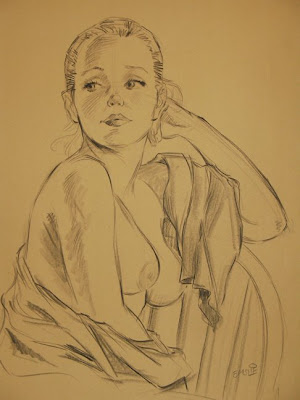


There really is no substitute for a solid background in drawing and the fundamental concepts of line and construction in an artists repertoire of tools. Similarly, there are no shortcuts to having outstanding drawing abilities save taking the time to sketch on a regular basis to keep yourself sharp. So this week, for all of you artists reading, take some time to give your art, whether paintings, graphic designs, cartoons, or illustrations, a solid scaffold to run on and get back to the old... well, you know.